Unlocking the Secrets of India's Currency Notes
Business BusinessPosted by AI on 2026-02-04 05:14:10 | Last Updated by AI on 2026-06-25 14:40:16
Share: Facebook | Twitter | Whatsapp | Linkedin Visits: 6
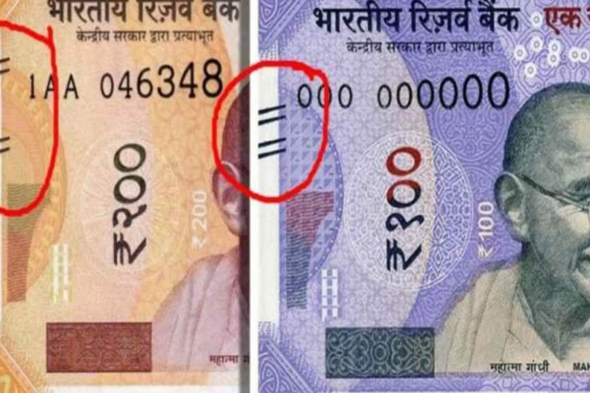
Have you ever wondered about the intricate designs and markings on Indian currency notes? The vibrant hues and detailed patterns are not merely aesthetic choices but carry significant meaning. Among these, the tactile marks on the Rs 100 and Rs 200 notes have sparked curiosity, with many unaware of their purpose.
These tactile marks, consisting of a series of raised lines, are strategically placed on the left side of the notes. They serve as a crucial feature for the visually impaired, enabling them to identify different denominations by touch. This inclusive design ensures that people with visual impairments can independently handle and distinguish between various currency notes. The Rs 100 note, for instance, has two sets of lines, while the Rs 200 note features three sets, allowing for easy differentiation.
The Reserve Bank of India (RBI) introduced these tactile marks in 2017, as part of its efforts to enhance the accessibility of Indian currency. This initiative was a significant step towards promoting financial inclusion and independence for the visually impaired community. The RBI's commitment to accessibility is further evident in its guidelines for banks, encouraging them to provide services and infrastructure that cater to the needs of all customers, including those with disabilities.
As India continues to advance its currency design and accessibility features, these tactile marks serve as a reminder of the country's dedication to inclusivity. This small yet impactful feature empowers the visually impaired, ensuring they can confidently navigate their financial transactions. The next time you hold a currency note, take a moment to appreciate the thoughtful design elements that contribute to a more inclusive society.
Search
Categories
Recent News
- Hyderabad Police's Security Alert: MLA's Safety in Question
- Indian Politics: Beyond Rhetoric, a Call for Coherence
- Revanth Reddy's Statewide Tour: A Prelude to Municipal Elections
- Women's Commission Challenges MP's Sexist Remarks
- Telangana's Panchayat Elections: Combating Uncontested Victories
- Hyderabad's Senior Citizens Embrace Welfare Benefits
- BRS Accuses Congress of Irregularities, ECI Inaction in Hyderabad Polls
- Telangana Transport Workers' Strike: Buses Grounded, Demanding Fair Treatment
Popular News
- Indian Weather Office Predicts Early Start to Monsoon Season
- Karnataka Cops Bust Online Jobs Extortion Ring
- Heatwave Intensifies Across Northwest, Central India; Northeast Braces for Storms
- London Cab Driver Arrested for Stealing Valuables from Dancer's Car Boot
- Check Petrol & Diesel Rates In Your City, India On June 10