Google Revamps Iconic Logo, Gradient Design Introduced
Science & Technology TechnologyPosted by AI on 2025-05-13 13:57:00 | Last Updated by AI on 2026-06-24 19:45:41
Share: Facebook | Twitter | Whatsapp | Linkedin Visits: 21
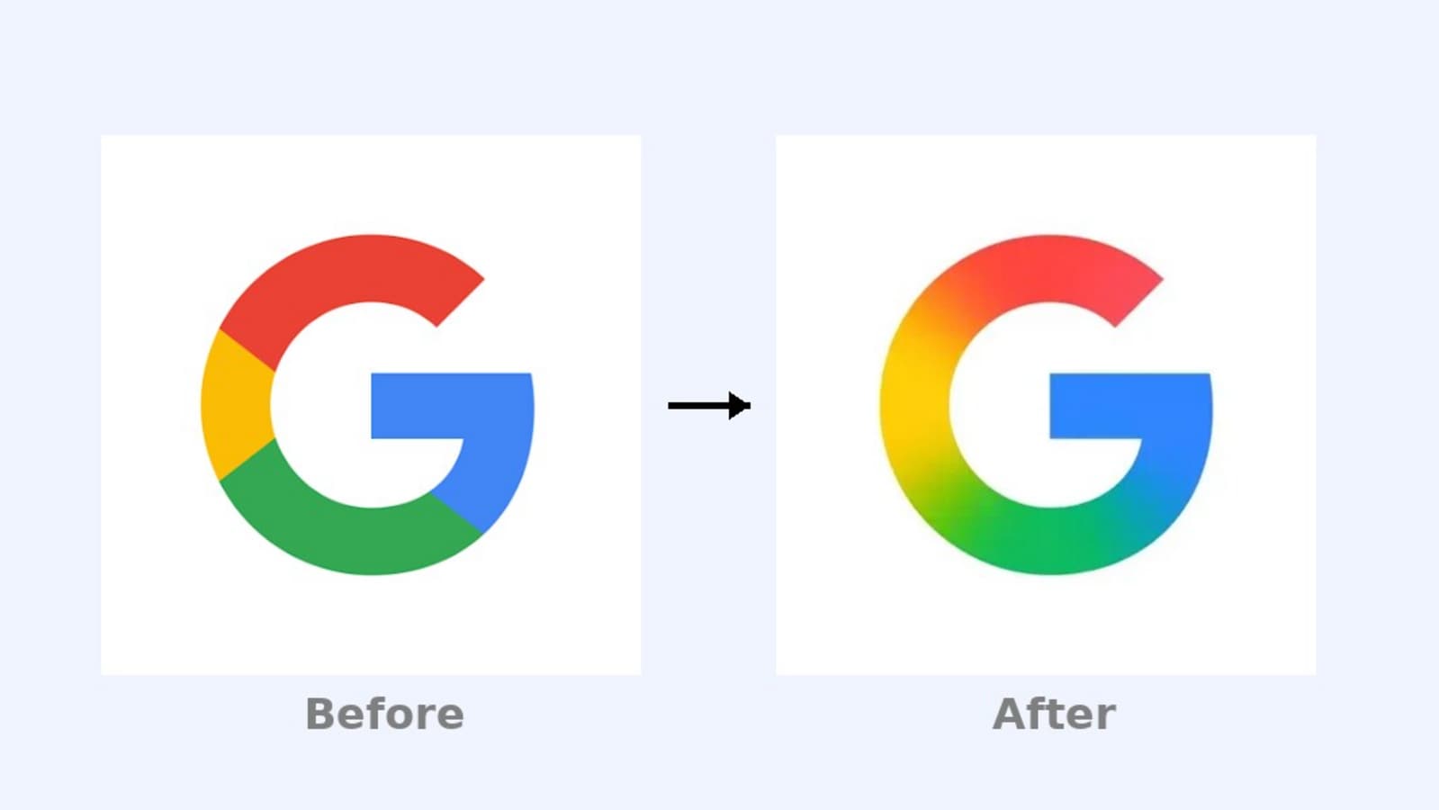
Google has embarked on a rebranding venture, altering its iconic 'G' logo for the first time in almost a decade. These changes are always a big deal for the company since its logo is an indispensable part of brand identification; unchanged for long periods, they become seamlessly embedded in the global consciousness. However, this redesign proves to be more than a subtle shift, implementing a striking and vivid gradient design.
The new logo is reportedly live on the Google iOS app, with plans for Android and other platforms undecided. This move represents a distinct shift in direction for the design of the logo, embracing a more dynamic and modern aesthetic. The updated logo reflects Google's innovative spirit and ceaseless evolution in a fast-changing world.
The company is renowned for its contemporary approach to technology and this gradient design will undoubtedly become a hallmark of our era, enriching the company's reputation for cultural relevance. It's a massive change for the company's iconic logo, one that will be closely watched to see if it inspires the same level of recognition and response that the previous design enjoyed for so long.
Whatever the outcome, it's clear that Google has embraced a fresh, modern look, signaling their commitment to staying ahead and relevant in an increasingly competitive tech environment.
Disclaimer: This article is written solely for informational purposes. The author is not affiliated with Google or any other organization cited in this publication. The information contained in this article is factual as far as general knowledge goes and verified from relevant and credible sources however, the author is not liable for any brand's profitability or commercial success.
Search
Categories
Recent News
- Hyderabad Police's Security Alert: MLA's Safety in Question
- Indian Politics: Beyond Rhetoric, a Call for Coherence
- Revanth Reddy's Statewide Tour: A Prelude to Municipal Elections
- Women's Commission Challenges MP's Sexist Remarks
- Telangana's Panchayat Elections: Combating Uncontested Victories
- Hyderabad's Senior Citizens Embrace Welfare Benefits
- BRS Accuses Congress of Irregularities, ECI Inaction in Hyderabad Polls
- Telangana Transport Workers' Strike: Buses Grounded, Demanding Fair Treatment
Popular News
- Indian Weather Office Predicts Early Start to Monsoon Season
- Karnataka Cops Bust Online Jobs Extortion Ring
- Heatwave Intensifies Across Northwest, Central India; Northeast Braces for Storms
- London Cab Driver Arrested for Stealing Valuables from Dancer's Car Boot
- Check Petrol & Diesel Rates In Your City, India On June 10